Challenge:
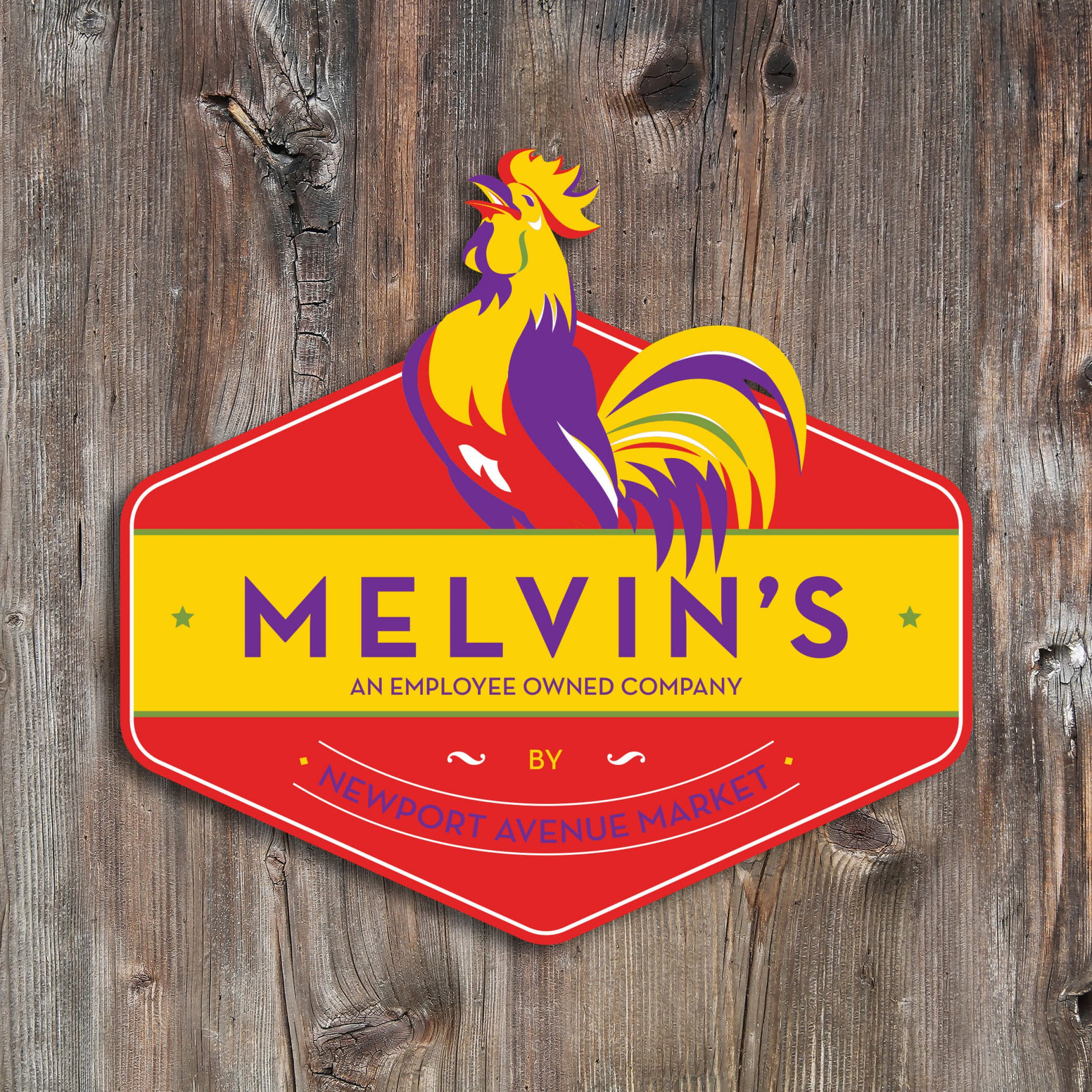
When the stars aligned for long-time Every Idea client Newport Avenue Market to purchase Sisters’ beloved store, Melvin’s, it just made sense. After all, Newport Avenue Market has been Bend’s beloved, locally owned (and now employee owned), specialty grocery store since 1991. Melvin’s is clearly well-aligned with Newport’s commitment to offering high-quality and local products. What wasn’t clear is how the store would be rebranded to keep the integrity of its unique Sisters personality, but with an infusion of Newport’s fun, flavor, and flair. That’s where Every Idea came in.
Insight:
The words “by Newport Avenue Market” was important to incorporate into the new brand, but even more important was to keep Melvin’s front and center. Sisters and Bend, albeit both popular Central Oregon towns among locals and visitors alike, are very different from each other. The new Melvin’s logo needed to look fresh, contemporary, say “grocery store” clearly, but also keep the hometown, “country” Sisters feel.
Solution:
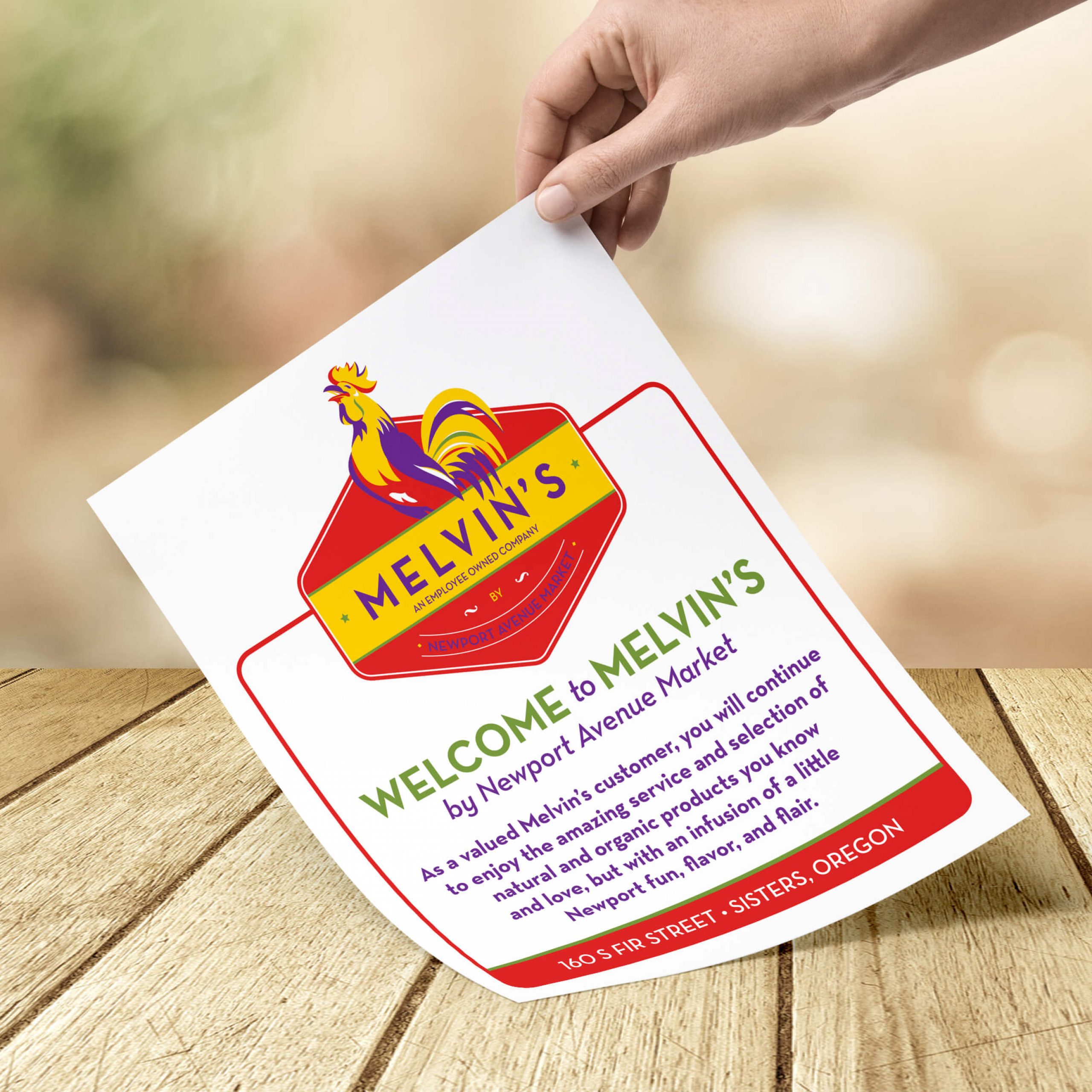
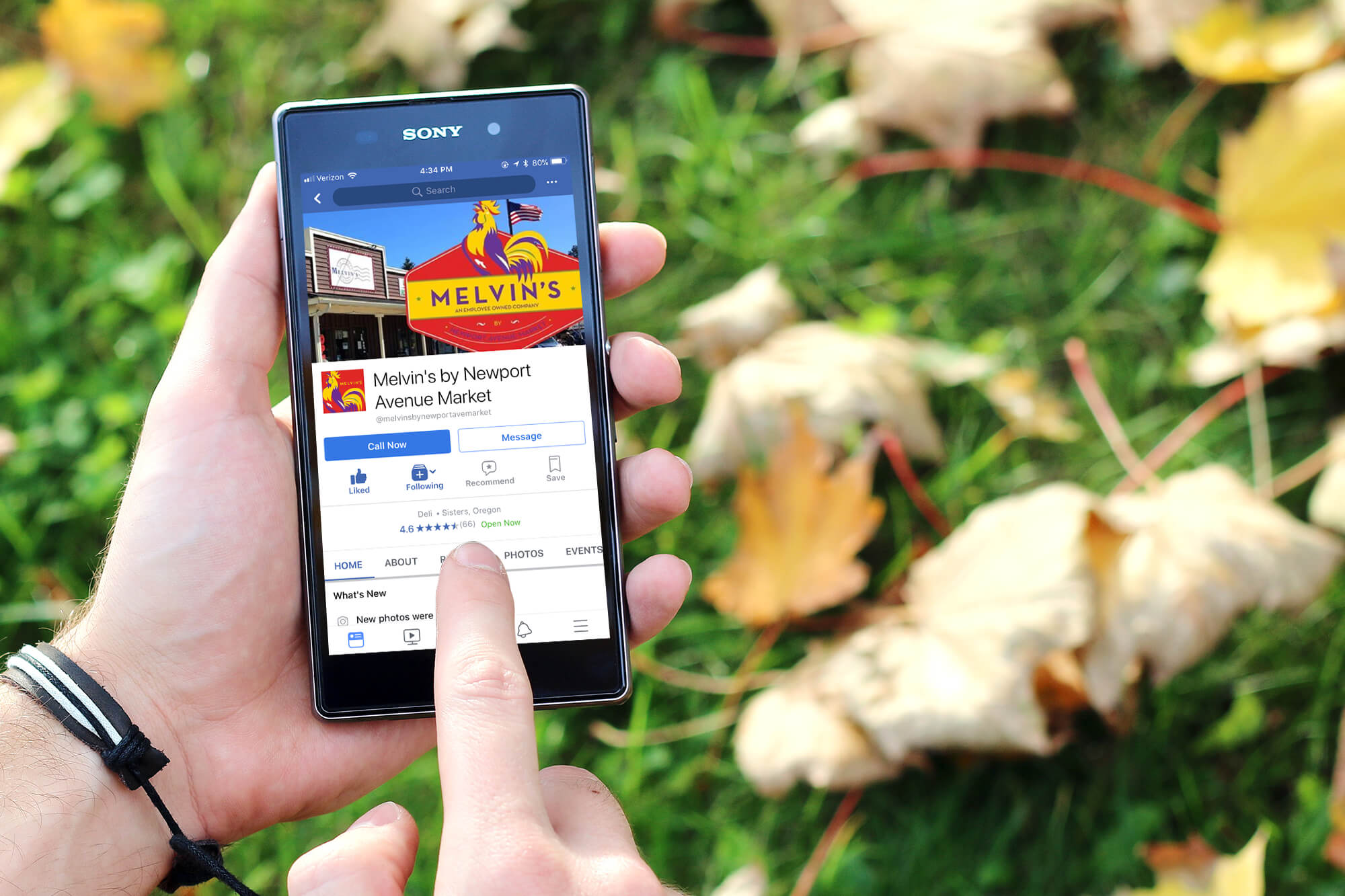
Every Idea developed the Melvin’s logo with its unique set of colors, red and yellow, but with Newport’s colors, purple and green, as accent colors to tie the two brand together. We also created a unique Melvin’s motif with a rooster head that has become the visual identity and fun character of the store. At times when a more simplified logo is necessary, on receipts for example, the team designed a version that keeps the integrity of Melvin’s and the Newport name, but without the intricate rooster head.
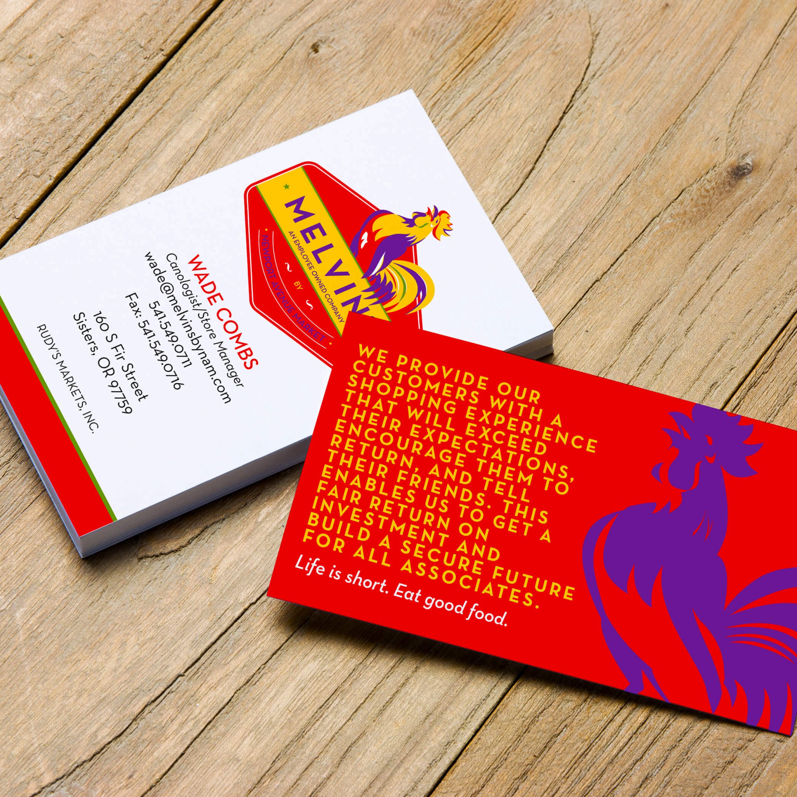
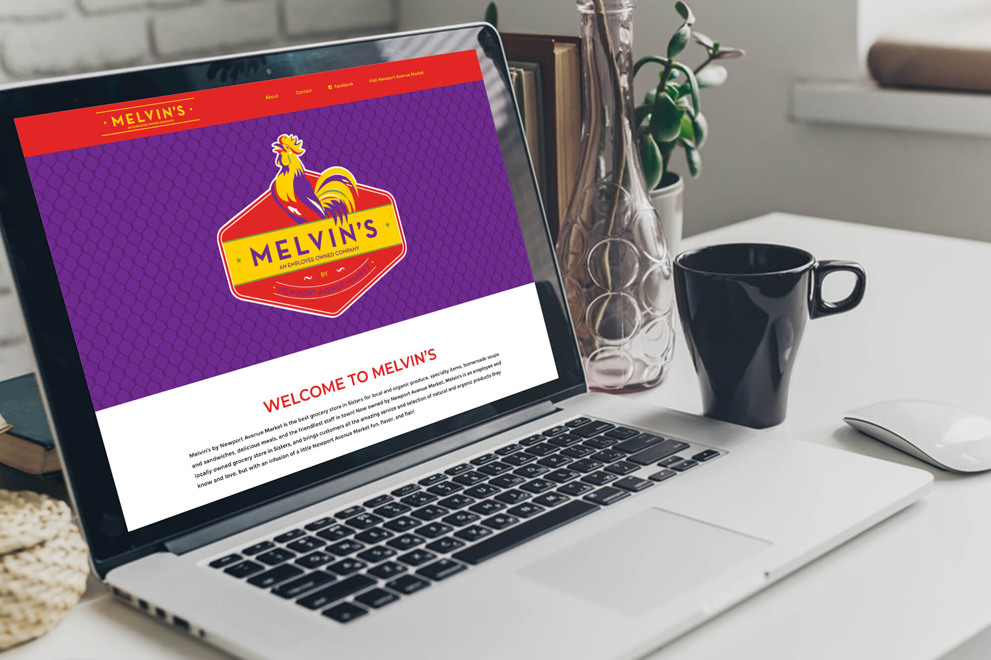
We’ve executed the new logo and branding elements on business cards, store signage (interior and exterior), collateral, social media, website, and more.
Results:
Legacy Melvin’s customers love the new look and feel of the Melvin’s brand, and new clients identify with the fresh, bold, contemporary feel. The brands coexist well on co-branded efforts, and the store is creating a personality rooted in a solid foundation, and built on today’s communication needs.
